
Colour
Power Pastels: How to be bold with a soft palette
Colour
Power Pastels: How to be bold with a soft palette
Brace yourselves: pastels are back in a big way. The candy coloured palette has been popping up on the runways of Europe and has even made its way into the beauty world, appearing on fashion and celebrity coiffes by the more daring of the bunch. [caption id="attachment_29123" align="aligncenter" width="460" caption="Jang Hyun Hong, photo courtesy of W Korea"]
 [/caption] [caption id="attachment_29124" align="aligncenter" width="460" caption="Burberry Prorsum Spring 2014 collection show during London Fashion Week at Kensington Gardens on September 16, 2013 in London, England"]
 [/caption] The word pastel for many conjures up immediate images of
Miami Vice and other guilty pleasures of the 80s. The new power pastels are less about a retro vibe and more about a modern interpretation of this soft colour palette that has often been pigeonholed as a strictly summer look or tied to a particular geography. Soft, sherbet tones are making their way out of nurseries and kids rooms and into main living spaces where their light and airy feel can be enjoyed year round. Here are a few ways to push the pastel palette into a zone that’s less sweet and more sophisticated. [caption id="attachment_29126" align="aligncenter" width="460" caption="photo courtesy of www.purerender.com"]
[/caption] The word pastel for many conjures up immediate images of
Miami Vice and other guilty pleasures of the 80s. The new power pastels are less about a retro vibe and more about a modern interpretation of this soft colour palette that has often been pigeonholed as a strictly summer look or tied to a particular geography. Soft, sherbet tones are making their way out of nurseries and kids rooms and into main living spaces where their light and airy feel can be enjoyed year round. Here are a few ways to push the pastel palette into a zone that’s less sweet and more sophisticated. [caption id="attachment_29126" align="aligncenter" width="460" caption="photo courtesy of www.purerender.com"]
 [/caption]
1 Treat pastels as neutrals The key to pulling off this new brave new twist on pastels is treating the soft hues as neutrals and pairing them will bolder colours.
Benjamin Moore’s Breath of Fresh Air is a perfect example of a pastel that can be applied as a neutral. [caption id="attachment_29130" align="aligncenter" width="251" caption="Breath of Fresh Air by Benjamin Moore, photo by Benjamin Moore"]
[/caption]
1 Treat pastels as neutrals The key to pulling off this new brave new twist on pastels is treating the soft hues as neutrals and pairing them will bolder colours.
Benjamin Moore’s Breath of Fresh Air is a perfect example of a pastel that can be applied as a neutral. [caption id="attachment_29130" align="aligncenter" width="251" caption="Breath of Fresh Air by Benjamin Moore, photo by Benjamin Moore"]
 [/caption] Move over beige and "greige," pastels fabrics on outdoor furniture is something we’re also going to see more of in the years to come.
Andrew Richard Designs, known for their luxury outdoor furniture, have long been ahead of trend cycles with their product offerings and it’s no different when it comes to power pastels. ARD currently offers a variety of Sunbrella pastel fabrics for their outdoor collections. [caption id="attachment_29139" align="aligncenter" width="460" caption="Sunbrella fabric, photo by Andrew Richard Designs"]
[/caption] Move over beige and "greige," pastels fabrics on outdoor furniture is something we’re also going to see more of in the years to come.
Andrew Richard Designs, known for their luxury outdoor furniture, have long been ahead of trend cycles with their product offerings and it’s no different when it comes to power pastels. ARD currently offers a variety of Sunbrella pastel fabrics for their outdoor collections. [caption id="attachment_29139" align="aligncenter" width="460" caption="Sunbrella fabric, photo by Andrew Richard Designs"]
 [/caption]
 [/caption]
2 Seek pastels applied to graphic patterns Combine pastels with bold graphic patterns, abstract repeats or fresh new takes on traditional looks like cross-stitch. This instantly takes the look from a soft hush to a cheeky blush in the room. [caption id="attachment_29150" align="aligncenter" width="459" caption="Right: Alexander McQueen Poppy wallhanging, photo courtesy of The Rug Company Left: Sarah Ellison wallpaper, photo courtesy of https://www.emilyziz.com"]
[/caption]
2 Seek pastels applied to graphic patterns Combine pastels with bold graphic patterns, abstract repeats or fresh new takes on traditional looks like cross-stitch. This instantly takes the look from a soft hush to a cheeky blush in the room. [caption id="attachment_29150" align="aligncenter" width="459" caption="Right: Alexander McQueen Poppy wallhanging, photo courtesy of The Rug Company Left: Sarah Ellison wallpaper, photo courtesy of https://www.emilyziz.com"]
 [/caption] [caption id="attachment_29153" align="aligncenter" width="460" caption="Sunbrella fabric, photo by Andrew Richard Designs"]
 [/caption]
3 Partner pastels with metallics and neon
Combine cooler pastels with warmer metallics to create subtle tension. Mint green and gold, pink and chrome – the metallic surfaces will add sparkle and vibrance to the soft pastel palette. [caption id="attachment_29154" align="aligncenter" width="460" caption="Paper Mache Bowl in Seafoam Mint Green and Gold, photo courtesy of www.etsy.com"]
[/caption]
3 Partner pastels with metallics and neon
Combine cooler pastels with warmer metallics to create subtle tension. Mint green and gold, pink and chrome – the metallic surfaces will add sparkle and vibrance to the soft pastel palette. [caption id="attachment_29154" align="aligncenter" width="460" caption="Paper Mache Bowl in Seafoam Mint Green and Gold, photo courtesy of www.etsy.com"]
 [/caption] [caption id="attachment_29155" align="aligncenter" width="320" caption="vintage chrome tufted chair sold by 1stdibs"]
 [/caption]
 [/caption]
4 Juxtapose colour with style Pairing a pastel with an edgy pattern or modern design instantly gives this palette new energy and life. The Bella Bar Stool and Table from Andrew Richard Designs in a powder blue and the iconic Wishbone chair in a range of pastel hues offer a cool new look to these designs. [caption id="attachment_29161" align="aligncenter" width="460" caption="Right: Bella Bar Stool and Table by Andrew Richard Designs Left: Wishbone chairs in candy coloured pastels"]
[/caption]
4 Juxtapose colour with style Pairing a pastel with an edgy pattern or modern design instantly gives this palette new energy and life. The Bella Bar Stool and Table from Andrew Richard Designs in a powder blue and the iconic Wishbone chair in a range of pastel hues offer a cool new look to these designs. [caption id="attachment_29161" align="aligncenter" width="460" caption="Right: Bella Bar Stool and Table by Andrew Richard Designs Left: Wishbone chairs in candy coloured pastels"]
 [/caption]
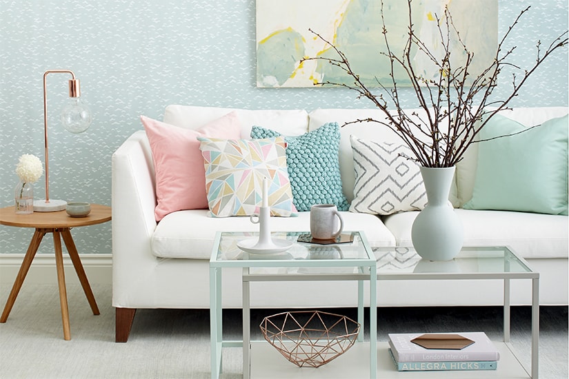
5 Pack it with pastels Lastly, go all out. Layer a room with pastels. A monochromatic scheme that uses these soft hues can have a very sophisticated, airy feel that’s also subtly dramatic. [caption id="attachment_29158" align="aligncenter" width="460" caption="photo courtesy of www.apartmenttherapy.com"]
[/caption]
5 Pack it with pastels Lastly, go all out. Layer a room with pastels. A monochromatic scheme that uses these soft hues can have a very sophisticated, airy feel that’s also subtly dramatic. [caption id="attachment_29158" align="aligncenter" width="460" caption="photo courtesy of www.apartmenttherapy.com"]
 [/caption]
[/caption] [caption id="attachment_29124" align="aligncenter" width="460" caption="Burberry Prorsum Spring 2014 collection show during London Fashion Week at Kensington Gardens on September 16, 2013 in London, England"]
[/caption] The word pastel for many conjures up immediate images of
Miami Vice and other guilty pleasures of the 80s. The new power pastels are less about a retro vibe and more about a modern interpretation of this soft colour palette that has often been pigeonholed as a strictly summer look or tied to a particular geography. Soft, sherbet tones are making their way out of nurseries and kids rooms and into main living spaces where their light and airy feel can be enjoyed year round. Here are a few ways to push the pastel palette into a zone that’s less sweet and more sophisticated. [caption id="attachment_29126" align="aligncenter" width="460" caption="photo courtesy of www.purerender.com"]
[/caption]
1 Treat pastels as neutrals The key to pulling off this new brave new twist on pastels is treating the soft hues as neutrals and pairing them will bolder colours.
Benjamin Moore’s Breath of Fresh Air is a perfect example of a pastel that can be applied as a neutral. [caption id="attachment_29130" align="aligncenter" width="251" caption="Breath of Fresh Air by Benjamin Moore, photo by Benjamin Moore"]
[/caption] Move over beige and "greige," pastels fabrics on outdoor furniture is something we’re also going to see more of in the years to come.
Andrew Richard Designs, known for their luxury outdoor furniture, have long been ahead of trend cycles with their product offerings and it’s no different when it comes to power pastels. ARD currently offers a variety of Sunbrella pastel fabrics for their outdoor collections. [caption id="attachment_29139" align="aligncenter" width="460" caption="Sunbrella fabric, photo by Andrew Richard Designs"]
[/caption]
To add a bit of bite to pastels, use them with contrasting hues in similar tones.
[caption id="attachment_29140" align="aligncenter" width="459" caption="Ombre rug by Kelly Wearstler, photo courtesy of The Rug Company, www.therugcompany.com"][/caption]
2 Seek pastels applied to graphic patterns Combine pastels with bold graphic patterns, abstract repeats or fresh new takes on traditional looks like cross-stitch. This instantly takes the look from a soft hush to a cheeky blush in the room. [caption id="attachment_29150" align="aligncenter" width="459" caption="Right: Alexander McQueen Poppy wallhanging, photo courtesy of The Rug Company Left: Sarah Ellison wallpaper, photo courtesy of https://www.emilyziz.com"]
[/caption] [caption id="attachment_29153" align="aligncenter" width="460" caption="Sunbrella fabric, photo by Andrew Richard Designs"]
[/caption]
3 Partner pastels with metallics and neon
Combine cooler pastels with warmer metallics to create subtle tension. Mint green and gold, pink and chrome – the metallic surfaces will add sparkle and vibrance to the soft pastel palette. [caption id="attachment_29154" align="aligncenter" width="460" caption="Paper Mache Bowl in Seafoam Mint Green and Gold, photo courtesy of www.etsy.com"]
[/caption] [caption id="attachment_29155" align="aligncenter" width="320" caption="vintage chrome tufted chair sold by 1stdibs"]
[/caption]
Pairing pastels with neon is a great example of just how playful and contemporary this look can get.
[caption id="attachment_29156" align="aligncenter" width="459" caption="photo source: www.101woonideeen.nl"][/caption]
4 Juxtapose colour with style Pairing a pastel with an edgy pattern or modern design instantly gives this palette new energy and life. The Bella Bar Stool and Table from Andrew Richard Designs in a powder blue and the iconic Wishbone chair in a range of pastel hues offer a cool new look to these designs. [caption id="attachment_29161" align="aligncenter" width="460" caption="Right: Bella Bar Stool and Table by Andrew Richard Designs Left: Wishbone chairs in candy coloured pastels"]
[/caption]
5 Pack it with pastels Lastly, go all out. Layer a room with pastels. A monochromatic scheme that uses these soft hues can have a very sophisticated, airy feel that’s also subtly dramatic. [caption id="attachment_29158" align="aligncenter" width="460" caption="photo courtesy of www.apartmenttherapy.com"]
[/caption]
Comments