
Trends
How to design rooms with the top paint hues of 2018

Image: Style at Home
Trends
How to design rooms with the top paint hues of 2018
From classic off-white to moody navy, next year’s hottest paint colours are an equal mix of timeless and statement-making shades.
When choosing a paint colour for a room, you're always faced with the same dilemma: Finding a perfect shade that is on-trend, you’ll love for years and isn’t totally #basic. Sound like an impossible task? It’s not! You just need to know the hottest shades of the moment and the best way to decorate with each.
We’ve handpicked our five favourite paint colours that experts say will be popular in 2018 and are revealing how to create an on-trend space you won’t tire of. In our roundup, you’ll find shades that are popular now as well as some unexpected ones. For each paint colour, we’re sharing innovative ways to use it in your home and the coolest accessories to pair with it.
Scroll down for our go-to shades for 2018 and get inspired to add a fresh look to your home.
1. Light Taupe

Although we’re forever fans of all-white kitchens, those with touches of taupe and grey are winning our hearts. Grey-painted cupboards are a chic way to add depth to your space while maintaining a neutral look, but we’re also fans of taupe or grey walls. Pair them with wooden accents and glam accessories for a space that’s equal parts welcoming and stylish. For a warm shade, try Off the Grid T18-08 by BEHR®.
Image: Stacey Brandford, A Build Basic Home Becomes a Space Filled With Timeless Elegance | 1. Silas Seagrass Bar Stools, CB2, $349-399 | 2. Mixed Inlay Cheese Board, Anthropologie, US$198
2. Off-White

There are a few reasons we love rooms with white walls. For one, choosing a great shade of white is relatively failproof, two, white walls offer rooms a fresh and bright feel, and three, white walls make selling your home easier. However, white walls can easily make a room look dull, empty and void of personality — but there are easy ways to prevent this. Try choosing an off-white paint colour as it’ll offer a warmer feel than a stark white shade. We love Soft Focus T18-09 by BEHR. As for decor, fill the space with pieces that are rich in colour and/or material. A vibrant rug, black and gold accents and dramatic pieces of furniture will add a stylish look and posh feel to the space.
Image: Robin Stubbert, An 1800s Home Pays Artistic Homage to Rural Life and Boasts a Laid-Back Urban Sensitivity | 1. Uptown Chandelier – 8-Light, West Elm, US$1649 | 2. Brilliant Poppies Rug, Anthropologie, US$248-1598
3. Millennial Pink

Back again for yet another run is millennials’ favourite colour, muted pink. This shade, a popular one for accessories, beauty product labels and everything in between, is sticking around, but this time, in a bolder, more nostalgic way. Reminding us of grandma’s house in the 90s, pale pink is being used in bathrooms, kitchens and dining rooms, and just about everywhere outside of little girls’ rooms. Play up the traditional use of the colour and pair it with delicate accessories and gilded extras, and juxtapose the space with a modern element such as vibrant teal velvet chairs in Mid-Century Modern style. For a shade that’s more chic than sweet, try Positively Pink T18-01 by BEHR.
Image: Stacey Zarin Goldberg, A Lesson in Decking Your Home With a Vivid Colour | 1. Buffet Wall Mirror, Wayfair, $640 | 2. Imaginist Dessert Plate, Anthropologie, US$12 each
4. Navy Blue

Add warmth and drama to your home by painting a room dark navy. We’re loving Constellation Blue T18-18 by BEHR. Keep the space from feeling too dark by filling it with plenty of white, natural elements and subtle pops of colour. In this kitchen, the space is kept bright with white cabinetry, stainless steel appliances, touches of greenery and shelves displaying line-ups of stunning cookbooks (not pictured, but can be viewed here). The space feels cool and modern and is packed with character.
Image: Mark Burstyn, Drab Kitchen and Outdoor Dining Space Go Bold in Black and White | 1. It’s All Easy, Indigo, $35 | 2. The Greenhouse Cookbook, Indigo, $29 | 3. Ceramic Small Head Planter, West Elm, US$34
5. Pale Teal
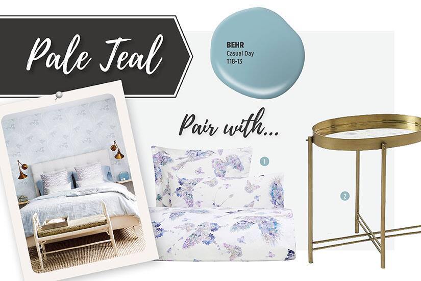
The bedroom is a space that should be serene, and a pale colour palette will ensure just that. We’re loving soft teal for this space, especially when teamed with printed wallpaper and textiles in complementary shades, which are sure to enhance the calm factor. Keep the space looking more tranquil, less boho, with floral or whimsy prints and golden accent pieces. Our favourite shade? Casual Day T18-13 by BEHR.
Image: Donna Griffith, Five Designers Work Together to Create the Tranquil Bedroom of Your Dreams | 1. Watercolour Bird and Butterfly Print Duvet Colour, Zara Home, $70-90 | 2. Brass Tray Side Table, West Elm, US$249
Comments