
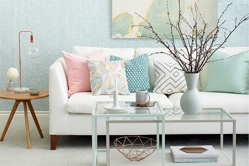
Accessories & Furnishings
the essential earth tones
Accessories & Furnishings
the essential earth tones
Our designer secrets special issue is out on stands now and I love all the tips inside from some of our fave design experts. I always get stuck trying to choose the perfect paint {hey, some shades just look too darned alike}, so I really enjoyed the paint section of the issue with designers sharing their fave shades. Here are the earth tones that are making the experts swoon.
 1 Split Pea 16-28, Pratt & Lambert "I use this yellowy green in bathrooms and bedrooms to create a serene ambience." -
Michelle Mawby, Lucid Interior Design
2 Floating Islands P5127-34, Para Paints ""think Florida home circa 1990 meets Mies van der Rohe. This 'blush' adds a light, soft hue to any space and looks amazing when paired with charcoal, cream, navy or white." -
Angela Robinson, AR Design
3 Never Land P5026-85, Para Paints "I've always had a weakness for jewel tones! I recommend painting this green on walls in a semi-gloss finish to create drama, elegance and sophistication, then accenting the colour with accessories in burnt orange, electric blue, eggplant, black or white." -
Angela Robinson
4 Granny Smith SD008, Style at Home Collection, Beauti-Tone Paint "When used to create a feature wall, this shade provides a gorgeous pop of colour that doesn't overpower a room. It's a huge trend right now to use a chartreuse or citron." -
Jessica Kelly, Jessica Kelly Design
5 Folly Green 76, Farrow & Ball "This green, one of my most asked-about colours, looks great on library walls broken up with lots of bookshelves and neutral elements." -
Stacey-Litwin-Davies, Litwin-Davies Design
6 Willow CC-542, Benjamin Moore "This rich wall colour adds dimension to any room. I've used it on the walls in a panelled library, a dramatic dining room and a tiny jewel-box powder room. I love pairing it with brilliant colours like indigo blue or saturated colour." -
Samantha Farjo, Farjo Design
7 Rockies Brown 2107-30, Benjamin Moore "This colour, best in a pearl finish, pairs well with one of favourite David Hicks wallpapers called The Vase, which was actually inspired by his famous Coca-Cola-coloured walls." -
Timothy Mather, TM Design
8 Kendall Charcoal HC-166, Benjamin Moore "We've used this warm grey to make a bold statement and give rooms weight and depth. Whether it's used on a piece of furniture, built-ins, interior doors, or to accent a handrail, that bit of darkness creates a layered effect." -
Cindy Bleeks, Feasby & Bleeks Design
9 Black Blue 95, Farrow & Ball "This paint colour, which has a hint of blue, looks great on exterior doors." -
Cindy Bleeks
1 Split Pea 16-28, Pratt & Lambert "I use this yellowy green in bathrooms and bedrooms to create a serene ambience." -
Michelle Mawby, Lucid Interior Design
2 Floating Islands P5127-34, Para Paints ""think Florida home circa 1990 meets Mies van der Rohe. This 'blush' adds a light, soft hue to any space and looks amazing when paired with charcoal, cream, navy or white." -
Angela Robinson, AR Design
3 Never Land P5026-85, Para Paints "I've always had a weakness for jewel tones! I recommend painting this green on walls in a semi-gloss finish to create drama, elegance and sophistication, then accenting the colour with accessories in burnt orange, electric blue, eggplant, black or white." -
Angela Robinson
4 Granny Smith SD008, Style at Home Collection, Beauti-Tone Paint "When used to create a feature wall, this shade provides a gorgeous pop of colour that doesn't overpower a room. It's a huge trend right now to use a chartreuse or citron." -
Jessica Kelly, Jessica Kelly Design
5 Folly Green 76, Farrow & Ball "This green, one of my most asked-about colours, looks great on library walls broken up with lots of bookshelves and neutral elements." -
Stacey-Litwin-Davies, Litwin-Davies Design
6 Willow CC-542, Benjamin Moore "This rich wall colour adds dimension to any room. I've used it on the walls in a panelled library, a dramatic dining room and a tiny jewel-box powder room. I love pairing it with brilliant colours like indigo blue or saturated colour." -
Samantha Farjo, Farjo Design
7 Rockies Brown 2107-30, Benjamin Moore "This colour, best in a pearl finish, pairs well with one of favourite David Hicks wallpapers called The Vase, which was actually inspired by his famous Coca-Cola-coloured walls." -
Timothy Mather, TM Design
8 Kendall Charcoal HC-166, Benjamin Moore "We've used this warm grey to make a bold statement and give rooms weight and depth. Whether it's used on a piece of furniture, built-ins, interior doors, or to accent a handrail, that bit of darkness creates a layered effect." -
Cindy Bleeks, Feasby & Bleeks Design
9 Black Blue 95, Farrow & Ball "This paint colour, which has a hint of blue, looks great on exterior doors." -
Cindy Bleeks
Comments