
Colour
How to decorate with the top colours for spring 2017

Image: Pantone
Colour
How to decorate with the top colours for spring 2017
From Primrose Yellow to Lapis Blue, we're spotlighting Pantone's hottest hues for spring 2017 and revealing how to incorporate the shades into your home decor.
Pantone’s annual picks of the top colours for spring 2017 are interesting and invigorating, different from what we’ve seen in years past, and we can’t wait to incorporate them into our decorating projects this season. For a closer look at the colours and ways to inject them into your quarters, keep reading.
Pantone Colour: Primrose Yellow

Image: Anthropolgie
Get the Look: Anthropologie Parker Curtain
Add just a splash of yellow to your home in the form of curtains. Team them with a printed sofa or throw pillows for an bold, eclectic look.
Pantone Colour: Pale Dogwood

Image: Annie Sloan
Get the Look: Annie Sloan Chalk Paint in Antoinette
Coat your walls in this pretty pale pink paint that's inspired by some of the lavish interiors and decorative items popular during the 18th century in France, hence its name. But, despite its historic inspiration, this colour is timeless and will add elegance to your walls or to a piece of furniture that needs a little restoration.
Pantone Colour: Hazelnut

Image: Pottery Barn
Get the Look: Jali Geo Tufted Rug
Certainly one of the most neutral and most muted colours in Pantone’s palette of 10 hot colours for spring 2017, hazelnut is a warm taupe that will provide a strong anchor colour in any room. We love this rug, hand-tufted from 100% wool from Pottery Barn. It’s an easy piece to incorporate into almost any décor scheme.
Pantone Colour: Island Paradise

Image: Wisteria
Get the Look: Blue Colorblock Candleholders
These beautiful candleholders will add a touch of beach-inspired beauty to your home. Made with glass and painted on the inside in two shades of blue, they’ve got coastal chic style written all over them. They’re the perfect way to add that summer feeling to your home.
Pantone Colour: Greenery

Image: Janis Nicolay
Get the Look: Fresh florals
Pantone’s bright green pick is bold — so if the thought of a leprechaun-inspired rug or sofa is too much for your décor sensibilities, there are more subtle ways to bring this life-affirming colour into your home. Consider vibrant fresh florals and plants to add a natural pop of color to your space.
Pantone Colour: Flame
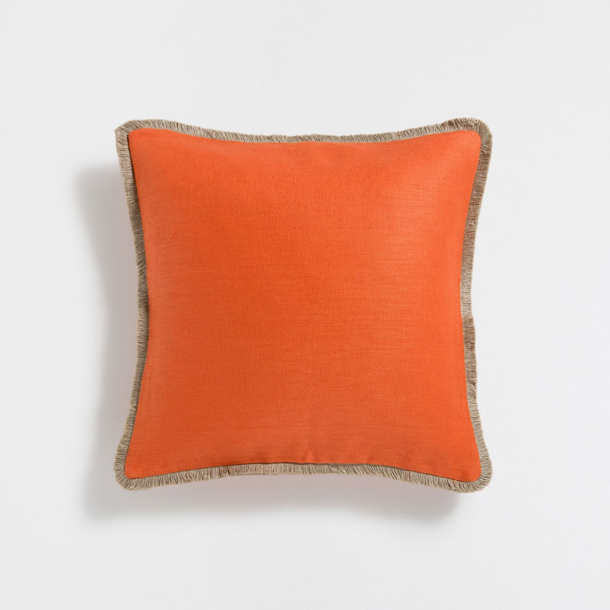
Image: Zara Home
Get the Look: Throw pillows
You may be surprised by how beautifully this bold colour can fit into your home. Paired with prints and other bright hues, these throw pillows will lend a cheery touch to your space.
Pantone Colour: Pink Yarrow

Image: Donna Griffith
Get the Look: Pretty in Pink accents
If the thought of pink makes you blush, perhaps you haven’t found the right shade. This cheeky, barbie-approved shade is determined to get noticed and used in moderation, it can be the perfect accent colour — say, for a dining room rug?
Pantone Colour: Niagara

Image: West Elm
Get the Look: Esme Sofa
This small-scale sofa has a mid-century modern appeal and is just the ticket to bring this warm blue into your home. Wrapped in a touchable soft velvet, this little sofa is full of personality and is destined to become a treasured piece in your home.
Pantone Colour: Kale

Image: Sarah Sherman Samuel
Get the Look: Headboard
Dark and moody, this deep green is can be a colour-lover’s neutral. Unobtrusive but unmistakeably brimming with life, we love how this colour the idea of incorporating hits of this hue into any room.
Pantone Colour: Lapis Blue

Image: KitchenAid
Get the Look: KitchenAid Stand Mixer in Blue Willow
Add a bright and bold splash of colour to your kitchen with a new KitchenAid stand mixer in "Blue Willow," an excellent match to Pantone’s "Lapis Blue."
Comments