
Colour
The psychology of colour
Colour
The psychology of colour
The psychology of colour is a rich and complex subject. It represents a field of study and research in and of itself. The psychology of colour is also influenced by cultural and regional biases. There are, however, certain rules of thumb that can be used when attempting to predict and control the psychological effect a colour might produce in an interior space. If you have any doubts, though, it is safest to test a colour in your space before committing to it.
One important consideration is the position of the colour in the space. The same colour will appear very different on the floor versus on the wall versus on the ceiling. As an experiment, take a large swatch of colour and hold it in each of these three different orientations. The starkest difference is the ceiling orientation, which makes the colour appear grayer. The position of a colour in the space also has a significant impact on the psychological effect of the colour. For example, a rich burgundy carpet on the floor will feel warm, solid, and almost regal. That same burgundy on the ceiling will most likely look heavy, intrusive, and disturbing. So, orientation is a key consideration when you are trying to predict the psychological effect of a colour selection.
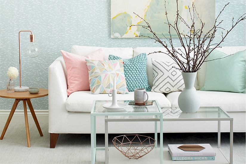
Each colour creates a relatively commonly shared set of psychological associations. These associations vary slightly from person to person, and they vary significantly depending on the context and surrounding colours. Still, it is helpful to have a set of general points of reference to better understand the psychological effect that each colour creates.
Common colour associations
• Red -- arousing, exciting, stimulating. It is also considered to be strong and masculine. It is a warm colour and is often thought of as actually hot. It advances relative to other colours, making it appear closer. Red is associated with passion and vigour.
• Pink -- soft, acquiescent, sensuous. As red shifts to pink, it often shifts gender association from masculine to feminine.
• Orange -- exciting, stimulating, intense. The liveliness of orange has an almost whimsical quality that is less serious than red.
• Peach -- soft, sunny, warm. Soft peach has a feminine quality to it.
• Yellow -- luminous, sunny, cheerful. Soft yellows can seem expansive and open, which magnifies the feeling of spaciousness. Intense, pure yellows can seem acidic and irritating in large amounts but whimsical and energizing in smaller amounts.
• Pale yellow -- neutral, expansive. As yellow pales, it loses its colour and requires a cool adjacent colour to react with to have any colour dynamic in the space.
 | Excerpted from Interior Color By Design by Jonathan Poore, with photography by Eric Roth. Copyright 2005 by Jonathan Poore. Excerpted with permission by Quayside Publishing Group. All rights reserved. No part of this excerpt may be reproduced except by permission in writing from the publishers. |
• Green -- restful, relaxing, quiet. Deep greens can be somber by themselves but become fresh and full of life when contrasted against warmer colours. Pure greens have an association with vegetation.
• Pale green -- lively when mixed with yellow. More quiet and introspective when mixed with blue.
• Blue -- peaceful, calm, tranquil. Blue, when used in large amounts in its pure hues, can feel cool and melancholy.
• Pale blue -- atmospheric, calm, spacious. Pale, cool blue tends to recede and, therefore, often makes spaces feel larger, especially when used on high ceilings.
• Blue-green -- blue-green in its deeper forms is rich and complex. It spans the psychological associations of blue and green and often changes character with the changing light. Pale blue-green has a dense, atmospheric quality but does not recede as dramatically as pale blue.
• Purple/violet -- rich, regal, mystical. Purple has both a calm yet mysterious psychological association. Deeper purples and violets have a powerful yet introspective association.
• Pale purple/lavender -- soft, sensual, quiet. Pale purple and lavender often have a feminine association.
• White -- purity, light, cleanliness. White has strong associations, even though we are often not fully aware of them. When used in excessive amounts, white feels sterile.
• Black -- power, elegance, dignity. Black also has strong psychological associations. When used in excessive amounts, black feels oppressive.
• Grey -- conservative, quiet, calm. When mixed with quiet browns, grey can combine a warm richness with the sense of quiet dignity.
• Brown -- earthy, stabile, secure. Brown is associated with the earth and natural materials. It often conveys a sense of permanence and familiarity.
| Excerpted from Interior Color By Design by Jonathan Poore, with photography by Eric Roth. Copyright 2005 by Jonathan Poore. Excerpted with permission by Quayside Publishing Group. All rights reserved. No part of this excerpt may be reproduced except by permission in writing from the publishers. |
Comments