
Decorating & Design
This house makes the most out of its small space

Photography, Mike Chajecki.
Decorating & Design
This house makes the most out of its small space
Designer Iman Lalji divides and conquers the main-floor storage and space challenges for a family of five.
It started as most renos do – small. Small house, lack of storage, and a modest proposal. Initially, the owners decided to update the main floor of their 700-square-foot Toronto home on their own. Before long, they ran into... challenges. They couldn’t agree on what to do. Luckily, they did agree on handing the project over to designer Iman Lalji.

Photography, Mike Chajecki.
“The owners wanted more functional living areas for their family of five,” says Iman, who could see right away that the job would require more than new furniture. “They wanted to maximize their small space by improving storage, without skimping on style and elegance,” she says, and for that a new layout was paramount.
Iman opted to divide the area into dining, living and kitchen spaces. “The mandate was sizable,” says Iman. “If we weren’t careful, the three adjoining rooms would have looked like a bowling alley!” Her solution was to carve out separate areas, each with a distinct mood but united by a livable-chic palette of white and beige with the warmth of gold accents and wood furniture – and an amazing new feature wall dividing the living and dining rooms. “Now the family can all be on the main floor and enjoy the spaces either together or separately,” says Iman. “Kids can read in the living room, parents can cook dinner, and they can all come together for meals.” You might say, this is one happy party of five.
Comfy, cozy and chic
Designer Iman Lalji designed a fabulous feature wall to divide the living and dining rooms. More than just a pretty face, it holds the TV screen, a cabinet for electronics, and storage for board games. Cutouts add interest and keep the look lighter than a solid slab wall would. The wood tones lend warmth. “I didn’t want to blow up my clients’ budget, so I used melamine, which looks just like wood,” says Iman. The giant sectional is big enough for the whole family but doesn’t overwhelm the space, and elegant new panelling is highlighted with chic sconces and wallpaper that looks like art.
Entrez new

Photography, Mike Chajecki.
The entryway’s terrazzo floor brings a bit of pizzazz to this busy zone. “We added a gold profile to separate the tile from the wood flooring,” says Iman. It hints at the further hits of gold she used throughout the main floor. New cabinetry for front-door storage was a must-have. Every little bit helps in a small space.
Dining in

Photography, Mike Chajecki. TABLE AND CHAIRS, Rove Concepts.
The sleek L-shaped banquette gives the dining area a restaurant vibe. “I used a vegan material that looks like leather but is super easy to clean,” says Iman, knowing a family with young kids prizes easy-to-clean surfaces. The homeowners really loved the colour blue and wanted to fit it in somewhere. “The banquette base was a great place to use it, and it’s easy to change later if they tire of it,” says the designer
”The floor plan was tricky! The most challenging, in fact. Creating three separate spaces made it easier and really avoided a bowling alley feel.”

Photography, Mike Chajecki.
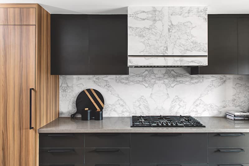
”We love this kitchen, but the most important feature for us was expanding it, since we wanted [to give the family] more kitchen space. But we get the most compliments on the beautiful hood and fridge/freezer layout – so seamless and well designed!”

Photography, Mike Chajecki.
Making room

Photography, Mike Chajecki. Porcelain BACKSPLASH, Porcelanosa. Quartz COUNTERTOPS, KSTONE Quartz. COUNTER STOOLS, Rove Concepts.
The owners need tons of storage in the kitchen, but they didn’t want it to look that way! “We had to find a balance between open and closed spaces,” explains Iman. An island fitted with a sink is at the heart of the hardworking room; the walls on either side are visually symmetrical and offer closed storage (including panelled appliances for a streamlined look) and open storage and display. Banks of drawers provide a ton of space for utensils and small appliances. An elevated wine wall is lit for a bit of drama, and furthers the restaurant feel of the dining area.
Photography, Mike Chajecki.

Canada's most beautiful hotel lobbies
Comments