
House Tours
Great Lake House

Photography: Patrick Biller
House Tours
Great Lake House
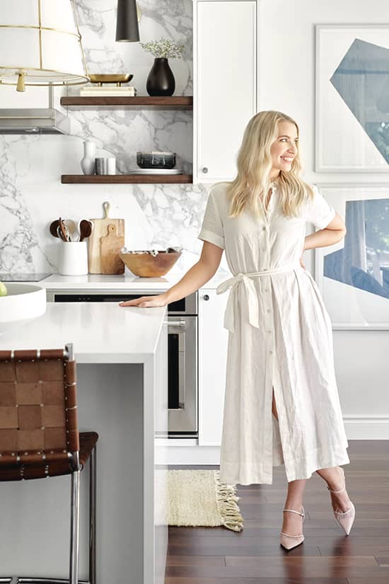
A home steps from Ontario’s Lake Huron brims with high-impact design and inspirational touches, including lively splashes of blue.
Context is everything, especially in design. “This bungalow is a walk away from beautiful Lake Huron so it had to have hints of blue and a coastal vibe,” says designer Tiffany Piotrowski of Tiffany Leigh Design. In other words, the home needed a sea change of colour, pattern and shapes to take its 1,500 square feet from builder-blah to contemporary-cool. In her own words, here’s how Tiffany did it.
Photography: Patrick Biller
Pattern Play
“A couple with two little girls lives here so I wanted the home to feel young and fresh. This small entrance needed to convey that, and make an impactful statement that would set the tone for the rest of the home. I chose wallpaper that felt bold, graphic and fun. Using it in a small area like a foyer maximizes impact but minimizes cost.”

Photography: Patrick Biller
Square Space
“The black squares on the blue wallpaper are the star here. The bench’s upholstery, a tonal windowpane check, acts as a subtle and playful nod to the wallpaper’s squares. The trick to repeating similar shapes is to modify scale – where the wallpaper squares are large and spaced apart, the windowpane check is quite small and tight.”

Photography: Patrick Biller | DESIGN, Tiffany Piotrowski, Tiffany Leigh Design Inc. PENDANT LIGHT, Elte. WALLPAPER, Kelly Wearstler for Lee Jofa. MIRROR, Wayfair. SIDE TABLE, LD Shoppe. CUSHION, Tonic Living. ARTWORK, Chelsea Fly. RUG, Dash and Albert. TILES, Creekside Tile.
Go Big
“The dining area is small, so I wanted it to have a big design presence. Instead of a wall covering, I hung four oversized abstract prints to add pattern and interest. A large shapely light fixture draws the eye, and adds drama and grand scale to what is otherwise a small space.”

Photography: Patrick Biller | Island PENDANT LIGHT, Hudson Valley Lighting. STOOLS, CB2. Dining CHAIRS, CHANDELIER, Elte. ART WORK, Celadon. VASE, McGee and Co. BACKSPLASH, Ciot. CUSTOM CABIN ETRY, Bruce County Custom Cabinets. Cabinet HARDWARE, Myoh. COUN TERTOPS, Caesarstone. SCONCES, Rejuvenation Lighting. Custom VENT HOOD, Cam-Fab Custom Metal. FAU CET, Rubinet. Island BOWL, West Elm. OVEN, KitchenAid.
On Repeat
“Repetition is key with colour and materials. The kitchen floor, bar stools and floating shelves are all a similar tone. I made sure to repeat the metallic elements elsewhere in the space: the light fixtures pick up on the brass strip on the vent hood. And the backsplash is the same slab of marble used on the fireplace.”

Photography: Patrick Biller | Fireplace Calacatta MARBLE, Ciot. FIREPLACE INSERT, Napoleon. Custom SOFA, Parklane Sofa. FLOOR LAMP, Wayfair. WALL PAINT, White Dove OC-17, Benjamin Moore. Custom DRAPERY, Sarit Arnesty Custom Drapery. DRAPERY FABRIC, Tonic Living. Blue and white CHAIR UPHOLSTERY, Virginia Kraft Textiles. TV, Sam- sung. TV DIGITAL ARTWORK, Juniper Print Shop.
Graphic Detail
“The fireplace’s marble veining is very organic and natural, whereas the chairs’ blue and white upholstery is graphic and punchy. They work well together yet are so completely different, they don’t compete. The clients already owned the chairs but we wanted to reupholster them and thought it could be a great graphic moment, and we were right! The chairs are my favourite element in the space.”

Photography: Patrick Biller | RUG, Elte. Cement COFFEE TABLE, CB2. Black TRAY, TLD Curated. Black SIDE TABLE, Urban Barn. TABLE LAMP, Crate and Barrel.
Curves Ahead
“I like to break up linear and straight elements with more organic or rounded shapes. Here, the columnar fireplace called for something a little softer, so I opted for a round coffee table. A trick to achieving the right balance is to look around your room and count the large elements – for every five straight-lined pieces, add one or two curvy shapes.”

Photography: Patrick Biller
Warm Front
“Whenever I’m working with a cooler palette (in this case, blue), I make sure to add in warm tones for balance. The living room’s creamier walls and pop of cognac leather keep the space from feeling cold and sterile. Some greenery adds in a layer of natural colour that doesn’t feel overpowering, while hits of black ground everything.”

Photography: Patrick Biller
Mix Master
“The mudroom had a walled-in closet with bifold doors and felt quite closed off. I ripped out the traditional closet in favour of millwork, which opened the space up and allowed me to add some textural interest with woven baskets, vertical shiplap and patterned pillows. There’s still ample storage, but the space feels so much larger.”

Photography: Patrick Biller | Slab TUB TILE, Ciot. FLOOR AND WALL TILES, Saltillo. Custom VANITY, Bruce County Custom Cabinets. MIRROR, Renwil. SCONCES, Elte. FAUCET, Rubinet. ARTWORK, Hannah Winters. TOWELS, Rainsford Company. Vintage milking STOOL, TLD Curated.
Balancing Act
“The durable drop-in tub was added for the girls and we gave it an elevated finish with a facing of [lightly veined] slab marble for a great high/low balance. Simple and easy-to-scrub subway tiles in the shower and darker grout keep cleaning low maintenance. Just like in the principal rooms, I layered soft blue tones throughout.”

Photography: Patrick Biller | Custom CABINETRY, Bruce County Custom Cabinets. HARDWARE, RH. Floor TILES, Creekside Tile. WALL TILE, Céragrès. COUNTERTOP, Caesarstone. Soap CANISTER, TLD Curated.
Tile File
“Because this is both the family bathroom and guest washroom, we wanted the finishes to feel elevated and pretty – but also durable for everyday use. Large, hexagonal floor tiles feel youthful and fun, yet take on a bit of elegance thanks to their refined Carrara marble and a border of lightly veined white marble. Bathrooms don’t have to be limited to just one floor tile.”
Photography: Patrick Biller
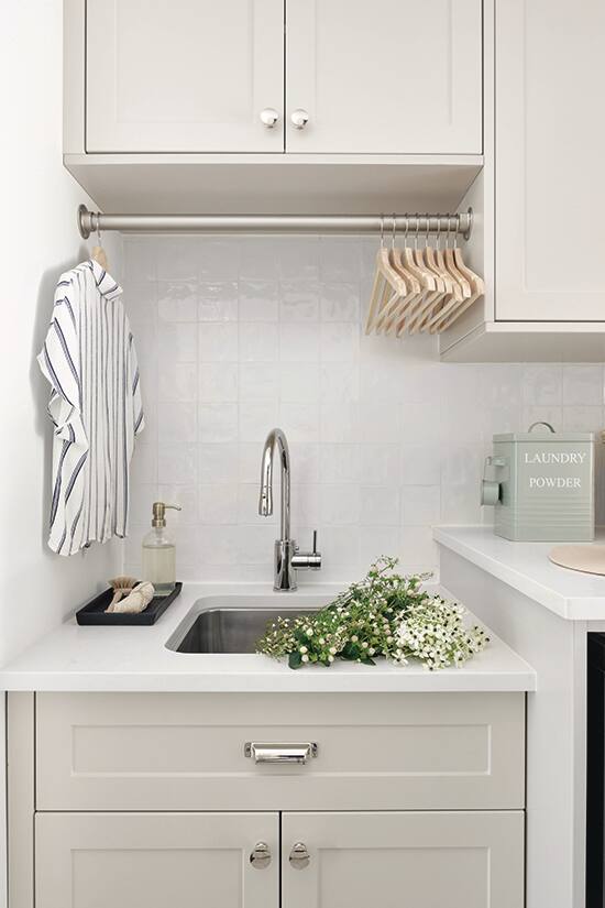
Smart Thinking
“The laundry room had an existing laundry sink, but it was at the same counter height as the washer/dryer, which made it difficult to use. Dropping the sink down to a standard counter height increased functionality and created a space to hang a drying bar above.”
Comments