
House Tours
Room to Flow

Photography: Patrick Biller | Styling: Me & Mo
House Tours
Room to Flow
Nine years after moving in, a total redesign and reorganization of space gives a family of five a brand new century-old home.
Every renovation comes with distinct challenges, but the redesign of this Edwardian century home in Toronto came with a particularly unique ask. Homeowners Lisa da Rocha and Claudio David wanted designer Megan Crosbie to lighten the dark, woodsy “Western ranch” look left behind by the previous owner, but not entirely. They wanted to simplify the interior, but preserve the exposed brick and Douglas fir beams.
“It already had some industrial flair – we wanted to maintain that and just add some contrast,” says Lisa, explaining that she, Claudio and their two daughters, 10 and 12, and son, 6, had already lived in the home for nine years, but weren’t making optimum use of it. Says Lisa: “It needed to be more functional, and more reflective of our tastes.”

Pictured: Designer Megan Crosbie | Photography: Patrick Biller | Styling: Me & Mo
With sights set on a clean, contemporary design, Megan shifted spaces, reimagined storage and thoroughly updated finishes. “Our goal was to turn it into a beautiful, bright and airy contemporary home for a busy family,” Megan says. “It needed to feel cohesive and kid-friendly, and be able to comfortably host extended family functions.” (When those are back on!)
Lisa asked for white walls, which are a great foundation for a modern look. “People often think white isn’t going to be the most kid-friendly, but it’s really just the walls,” Megan says. Structural changes included opening up the main floor for flow, shifting the kitchen into the huge family room at the back, creating three inviting kids’ suites on the second floor and transforming the unused third floor into a serene retreat for Lisa and Claudio, an executive leadership coach and entrepreneur respectively. Keeping most of the new finishes and larger pieces understated and neutral lets the industrial elements “shine through” as features. “With the white gallery wall feel, we were able to add fun pops of colour in the artwork,” Megan says.
A key consideration of the seven-month reno was adding enough storage to make maintaining the sleek minimalist interiors a breeze. Megan tucked in low-key storage pieces and built-in units throughout. “Integrating a ton of storage is a key component to modern design,” she says, so every bedroom has a walk-in closet, and the crawlspaces on the third floor are filled with hidden built-ins.
Lisa is delighted with the results and is looking forward to welcoming extended family and friends to the revamped modern Edwardian. “We were able to lay out the spaces in a much better way, and now we’re using so much more of the space as a family. We’ve always had these big gatherings, with 20 or 30 people, and looking into the future, we can’t wait to be able to do that again!”

Photography: Patrick Biller | Styling: Me & Mo
“I wanted the kitchen to feel integrated, clean and bright. It’s not a kitchen that screams, Look at me! It’s a kitchen that is gorgeous by the mere fact that it’s so simple,” says designer Megan Crosbie. “And with three kids, we needed everything to be indestructible, so we went with a Corian countertop and seamless cabinets.”

Photography: Patrick Biller | Styling: Me & Mo | ALL CABINETRY AND BUILT-INS DESIGN, Megan Crosbie Design. CONTRACTOR, Cornerbrook Construction. CABINETRY CONSTRUCTION, Fox Custom Woodworks. COUNTERTOPS and BACKSPLASH in Arctic Ice, Corian. Black BARSTOOLS, Stylegarage. PENDANT LIGHT by Lambert et Fils, Klaus by Nienkamper. OVENS, Gaggenau. Delta FAUCET, Taps.
The kitchen was relocated to the back of the house, where it shares space with the cozy family room. The pristine design is a striking contrast to the home’s exposed brick and rugged fir posts and beams, while offering all the desired amenities, including double wall ovens and a gas stove. Flat-front cabinet doors with touch-latch hardware keep the profile sleek.
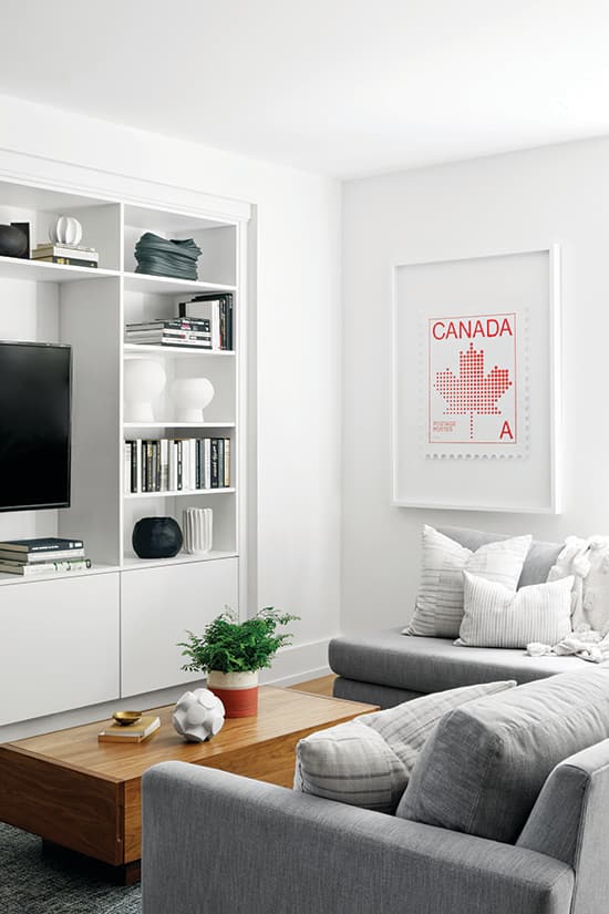
Photography: Patrick Biller | Styling: Me & Mo | SECTIONAL, Silva Custom. COFFEE TABLE, EQ3. BUILTINS CONSTRUCTION, Fox Custom Woodworks. ARTWORK by Peter Andrew, Art Interiors.
With its amply cushioned sectional and built-ins displaying books and collectibles, the snug, relaxed family room adjoin- ing the kitchen is the antithesis of the sleeker, more artful living spaces on the main floor. For consistency, the built-ins have the same clean-lined design and finish as the kitchen cabinets on the opposite wall. Two massive new windows overlook the backyard. “It feels like Muskoka out there,” Lisa says.
Photography: Patrick Biller | Styling: Me & Mo
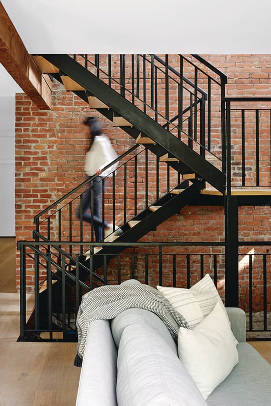
To bring the staircase, which had been opened up to the family room by the previous owner, in line with the redesign, Megan opted to swap in new treads to match the new floors. For contrast, she had the railing painted a matte black.

Photography: Patrick Biller | Styling: Me & Mo | CUSTOM COFFEE TABLE, Marshall Young Cabinetry. CLUB CHAIRS, STOOL, Stylegarage. MITCHELL GOLD + BOB WILLIAMS CHAISE, BLOOM RUG, Elte.
With its moody colour scheme, crisp geometric shapes and bold accessories, the living room feels like a carefully curated sculpture gallery. To embrace the unusual angled bay window in one corner, Megan had the solid oak coffee table custom made, then arranged a “conversation circle” around it. Upholstered in a soft, dark grey bouclé, the chaise in the window looks dramatic, which draws the eye to this unique architectural feature, but, ultimately, it’s a roomy, cozy perch that’s low enough to not chop up the sightline out the window.

Photography: Patrick Biller | Styling: Me & Mo | European Oak FLOORING, Moncer Specialty Flooring.
By turning it on its side, Megan reimagined the vintage Pepsi-Cola sign as ad hoc artwork. A plan to install a space-hogging walk-in pantry was jettisoned in favour of building in these full-height cupboards along the dining room wall (two units house dry goods; one stores cleaning supplies). Floors throughout the house were replaced with engineered wide-plank smoked European Oak in a brushed and oiled finish.

Photography: Patrick Biller | Styling: Me & Mo | TABLE, CHAIRS, SIDEBOARD, Design Within Reach. LIGHT FIXTURE, Casa Di Luce. QlockTwo CLOCK, DDC NYC. Black VASES, white BOWL, Elte.
The walnut dining room table and sideboard echo the warm tone of the beams. Megan has a background in fine art and integrates art into her projects. “It’s a part of the design process I really enjoy,” she says. “Artwork plays a key part to warming up the space. If you’re going to go with the all-white walls, you’re forcing yourself into this gallery feel, so you have to place the art strategically to have that right impact. Lisa and Claudio hadn’t invested heavily in art, so I was able to help select many of the pieces.” She found the large photographic piece by Jamie MacRae at Art Interiors.

Photography: Patrick Biller | Styling: Me & Mo | DAYBED, EQ3. RUG, Elte. DRESSER, Design Within Reach. WINDOW, Marvin.
Appointed with a simple claret velvet daybed, a dormer window in the new third-floor primary bedroom becomes an artful moment epitomizing the merging of the home’s old and new architectural elements. Megan tucked secret dresser drawers (left) and suitcase storage (right) into the low walls under the eaves, and installed a walk-in closet (through the door, far right) to maximize storage and minimize space-hogging furniture.

Photography: Patrick Biller | Styling: Me & Mo | BED, BEDSIDE TABLE, WHITE LAMP, Design Within Reach. Grey BEDDING, RH. Terracotta-colour PILLOWS, Elte and Elte Mkt. PLANT, POT, Dynasty. LIGHT FIXTURE by Bocce, Kiosk.
Packing in loads of hid- den storage allowed Megan to keep the look of the primary bedroom (formerly a little-used guest room) streamlined. “I wanted it to feel serene and peaceful,” she says. The warm tones of the velvet chaise and wood beams (which complement the pops of green foliage through the windows) ensure the airy space is also super cozy. The staircase was shifted from the centre of the room to the corner so the space wouldn’t feel chopped in half. In warmer months, a huge rooftop deck essentially doubles the floor- space of the serene primary suite.

Photography: Patrick Biller | Styling: Me & Mo | VANITY CONSTRUCTION, Fox Custom Woodworks. Arctic Ice COUNTERTOP, Corian. FLOORING, Saltillo Tile.
The awkward roofline forced Megan to get creative when designing the primary ensuite. While she packed in loads of storage space courtesy of a double vanity and extra-long medicine cabinet, the room’s white palette and floating vanity instill a sleek, modern aesthetic. “You can never have too much storage,” Megan says. “We made sure there is space for everything, so it can be tucked away out of view.” A luxe Blue Savoy marble floor is an elegant note.

Photography: Patrick Biller | Styling: Me & Mo | BED, CHANDELIER, BEDSIDE TABLE, Pottery Barn Kids. RUG, EQ3. STORAGE PIECE, IKEA. SHEETS, COVERLET, West Elm. DESK, ACCENT CHAIR, Structube. CHAIR, IKEA. ARTWORK, Minted. STORAGE BASKET, HomeSense. WALL LAMPS, CB2. ACCENT CUSHIONS, Tonic Living.
Previously, the owners’ three children – two daughters, 10 and 12, and son, 6 – shared a bedroom. Megan craftily divided the former primary into two kids’ rooms, stealing some floor space from the “massive” landing to give each child their own room. In the 10-year-old girl’s bedroom, the rich tones of the exposed beams and brick are off-set by a creamy white palette threaded with low-key accents in brass and the palest pink accents for a quietly boho mood. To balance the traditional headboard and bedside tables, which the owners already owned, Megan chose a storage cabinet with breezy rattan door- fronts. The roomy pop-out “treehouse windows” installed in all of the children’s bedrooms created inviting reading nooks and draw the eye out to the treed surroundings. “People call us the tree house. There are pines all around us, and every window you look out has greenery,” Lisa says.

Photography: Patrick Biller | Styling: Me & Mo | VANITY CONSTRUCTION, Fox Custom Woodworks. COUNTERTOP, Caesarstone. MIRROR, ACCESSORIES, CB2. SCONCE, Tech Lighting. Aquadesign TAPS AND FAUCET, Taps Bath. TILES, Ciot.
Megan pulled the romantic petal pink and raw brass tones from the adjoining bedroom into the 10-year-old girl’s ensuite. The round mirror contrasts the right angles and clean lines that define the interior design. “Pairing the mirror and sconces felt like a no-brainer to me!” she says. The flooring is a unique soft pink-blue-grey terrazzo.

Photography: Patrick Biller | Styling: Me & Mo | BED, Pottery Barn Kids. BEDSIDE TABLES, EQ3. RUG, Elte. ARTWORK, Minted. GREY DUVET COVER, West Elm. ACCENT PILLOWS, Tonic Living.

Photography: Patrick Biller | Styling: Me & Mo | DESK, Crate and Barrel. DESK CHAIR, ARMCHAIR, Structube.
To imbue a more grown-up air in the 12-year- old daughter’s bedroom, Megan brought in deeper pink, grey and blue tones pulled from a mod floral cushion on the bed. Trim wall-mounted bedside tables in walnut offer function without eating up floorspace. The quirky industrial-style bedside lamps were a “total steal” at HomeSense, and a back-painted glass whiteboard over the desk is a chic designer twist on the usual corkboard or chalkboard. The spacious kids’ bedrooms were all outfitted with homework desks.

Photography: Patrick Biller | Styling: Me & Mo | BATHTUB, BLACK SHOWERHEAD, TAPS and FAUCET by Jason Wu for Brizo, Taps. FLOORING, Ciot.
The largest of the kids’ bathrooms, the 12-year- old girl’s ensuite, was roomy enough to accommodate a stand-alone bathtub, glassed-walled shower and generous vanity. While black is employed throughout the house as a balance for the expanses of white, this is the one room where the designer went “full-on” black and white only, “and I think it really stands out,” she says.

Photography: Patrick Biller | Styling: Me & Mo
The dynamic terrazzo flooring merges the two contrasting hues. “When you take a design risk, there’s room for high reward,” says Megan. “I wanted to create a space that felt grown-up, without feeling stuffy or old. And the tile is so much fun, so we let that be the shining star here.” Translucent roller blinds offer privacy without cutting daylight.

Photography: Patrick Biller | Styling: Me & Mo | BED, CB2. YELLOW THROW, Elte. BEDDING, Pottery Barn Kids. ART (over bed), Etsy. BEDSIDE TABLE, SHELVING, DESK, EQ3. BASKET, HomeSense. BLUE VELVET CHAIR, Structube. Locker-style CABINETS, IKEA. WALL PAINT, Simply White OC-117, Benjamin Moore. ARTWORK (overlockers), Minted.
To ensure that the couple’s six-year-old son’s playful bedroom has staying power, Megan furnished it with a simple, neutral queen-sized bed and handsome modular oak shelving unit with desk that will grow with him, then layered in budget-savvy elements, like superhero bedding and cartoon art, to amp up the fun.

Photography: Patrick Biller | Styling: Me & Mo
“Everything is neutral, adaptable and durable,” says the designer. She chose shelving that echoes the look of the staircase. Art from Etsy (over headboard) was printed at Staples, and the cloud sconces are from IKEA.

Photography: Patrick Biller | Styling: Me & Mo
Megan had metal locker-style cabinets mounted on the wall so it’s easy to clean under them. “We weren’t too precious with the furniture,” she says. “The pieces in the kids’ rooms are from big-box stores. We didn’t blow the budget because they’re going to get wear and tear.”

Photography: Patrick Biller | Styling: Me & Mo | CABINETRY, Fox Custom Woodworks. BENCH, Design Within Reach. FLOORING, Saltillo Tile.
A new mudroom was added to take pressure off the front door, which opens to the living room. The high-functioning space, floored in rough-and-tumble slate, is packed with huge storage cubbies for the kids’ outerwear and gear, plus a coat closet for mom and dad. Felt baskets up top corral off-season accessories and supplies.
Comments