
Before and After
Before & after: An Edwardian-style home gets a contemporary update

Photography by Alex Lukey | Design by Croma Design | Styling by Christine Hanlon
Before and After
Before & after: An Edwardian-style home gets a contemporary update
A Toronto period house gets an old-meets-new update to suit a family returning from the U.K.
Besides its gorgeous bones, it was the history that endeared this gracious house to its current owners. “The same family had lived here for 40 or 50 years, and we pictured ourselves doing the same,” one of them explains. “We knew it was our forever home.”
The homeowners, who now have three children, aged six, eight, and 10, were living overseas in London when they purchased this stunning 4,000-square-foot Edwardian-style house in an established midtown Toronto neighbourhood. “When this house came on the market, we bought it knowing that we wanted to move back to Toronto at some point,” she says. “We just didn’t know exactly when.”
Built in 1929, the home was architecturally stunning and teeming with potential, but renovations over the years had left it dark, dowdy, and dated. So after renting it out for a year and a half, the couple decided to spruce it up before moving in. This meant imbuing its traditional envelope with the contemporary aesthetic they love. “We were inspired by London, where beautiful old buildings are updated with modern elements to amazing effect,” says the owner.
They enlisted Ryan Martin and Amy Kent of Croma Design in 2013 – at first collaborating via late-night phone calls from across the pond – to strike the perfect juxtaposition of old and new in a space suitable for their busy young family. Top priorities included brightening the interior, enhancing flow and making it feel more connected to the exterior.
Key to effecting the desired changes was putting on an addition at the back of the home. “The old garage that was there blocked the view of the beautiful back garden,” says Ryan. “So replacing it with a family room that includes a wall of windows and sliding doors helped bring the outdoors in.” In addition, it flooded the space with light and allowed for a large open-concept kitchen.
In the rest of the house, original architectural elements like wainscotting, hardwood flooring, leaded glass windows and a stone fireplace were restored to underscore the home’s character and charm. “Then we struck a balance by bringing in furnishings that have a bit more of a modern look but still work with those historic lines,” says Ryan. The resulting vibe is sophisticated yet comfortable, clean-lined yet warm.
Painting the envelope a crisp white offered a bright backdrop for a cohesive mix of neutral elements with hits of warm brass and cool blues. “Blue is a favourite colour for both of the owners,” says Ryan. “We didn’t want this to come across as a blue house, so we injected small doses of the hue here and there.”
After returning to Canada and moving into the house four years ago, the owners continued making it their own, keeping family life top of mind. “We don’t have white sofas, and we don’t have upholstered dining room chairs,” says one of them. “We didn’t want precious spaces that were off limits to kids. We wanted to use all of our rooms, and use them all the time.”
But, of course, even in the most attractive home, there is always an adjustment period. “We moved from a tiny, tiny, tiny flat in London,” says one of the homeowners. “At first, I think my kids didn’t know what to do with themselves in all this space!”
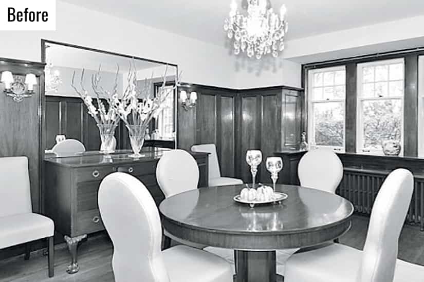
Dominated by stained wood panelling, the dining room was dark and uninviting.
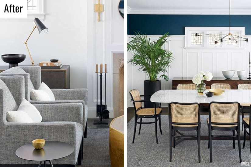
“I was hesitant to choose upholstered dining chairs,” says one of the homeowners, who found great caned bentwood alternatives. She did indulge her love of marble here: “We weren’t brave enough to do marble kitchen counters, but this tabletop felt less risky.” Mouldings accentuate the living room’s original Tudor Revival-style stone fireplace, while leaded glass windows (which the previous owners had drywalled over) lend charm. Sleek furniture tempers historical elements for a current look.
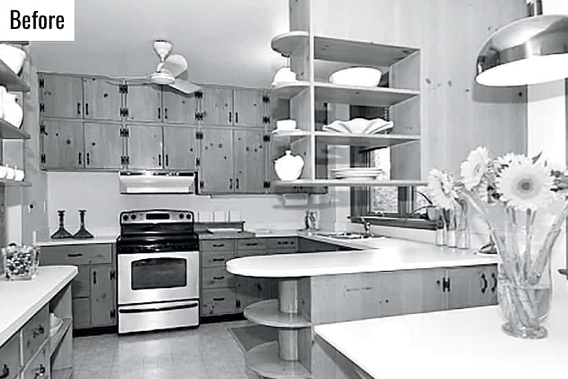
Plentiful yet dysfunctional cabinetry gave the kitchen a closed-in feel.
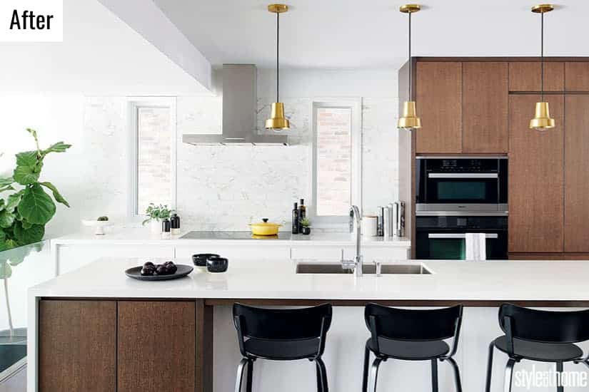
The new addition allowed designers Ryan Martin and Amy Kent to expand and reconfigure the kitchen. “The owners were torn between wood and white cabinetry, so we included both,” says Ryan of the mixed stained oak and lacquered cabinets, which boast integrated recessed pulls for a clean look.
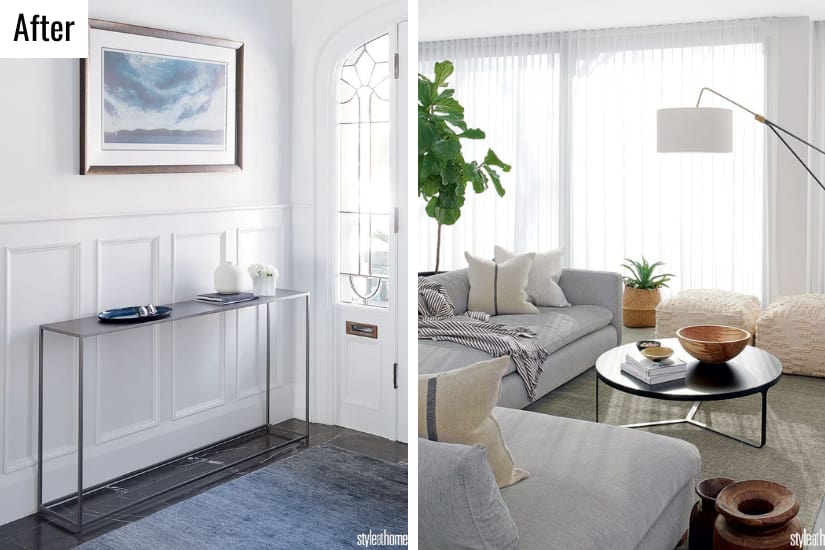
With the old vestibule enclosure removed, the front entry feels airy. Contemporary pieces, such as the console, let the historic architecture shine. In the new addition, a wall of windows and glass doors offers the family room sunlight and backyard access. The inviting neutral scheme gets a comfy boost from heated porcelain floor tiles layered with a rug.
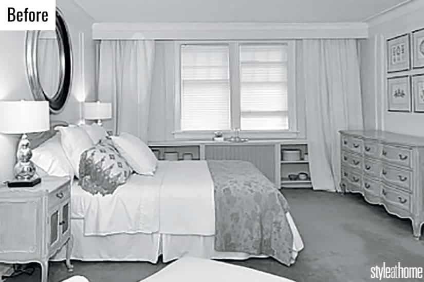
In a different part of the house, the old master bedroom felt cramped.
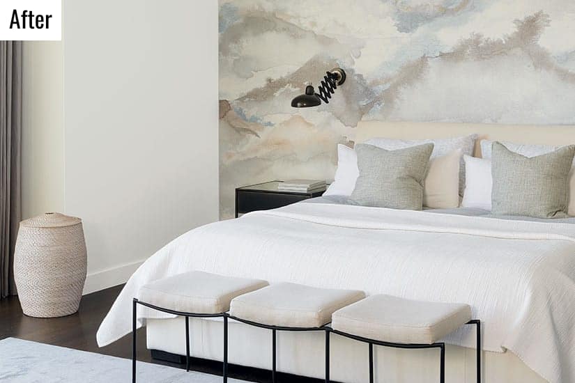
A muted palette of creams, pale greys and icy blues gives the master bedroom a serene ambience, enhanced by the wallcovering. “The wallpaper brings in all of the room’s colours in a soft way,” says Ryan. “It almost has a watercolour effect.”
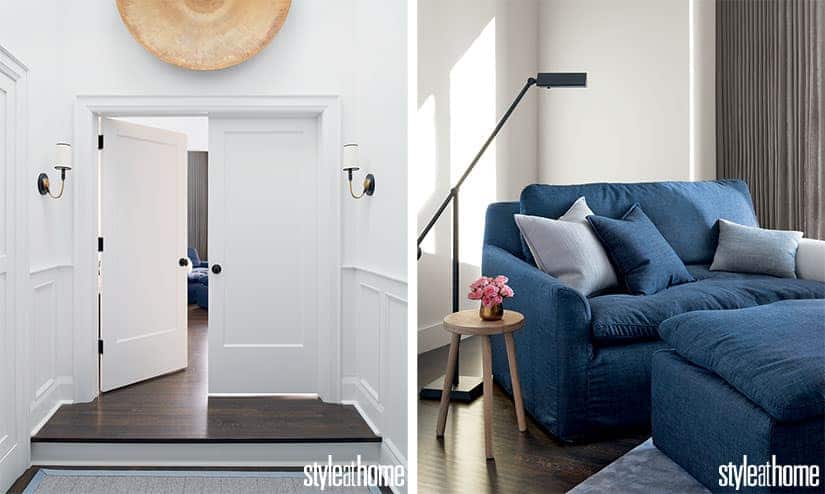
Defined by eye-catching wainscotting, the spacious hallway leading to the master suite is as grand as the room itself. At the other end of the primary, a pair of oversized armchairs is cozy and convenient. “This is a really great area for everyone in this young family to curl up and read books together, or for the parents to just relax and enjoy a coffee and the newspaper,” says Ryan.
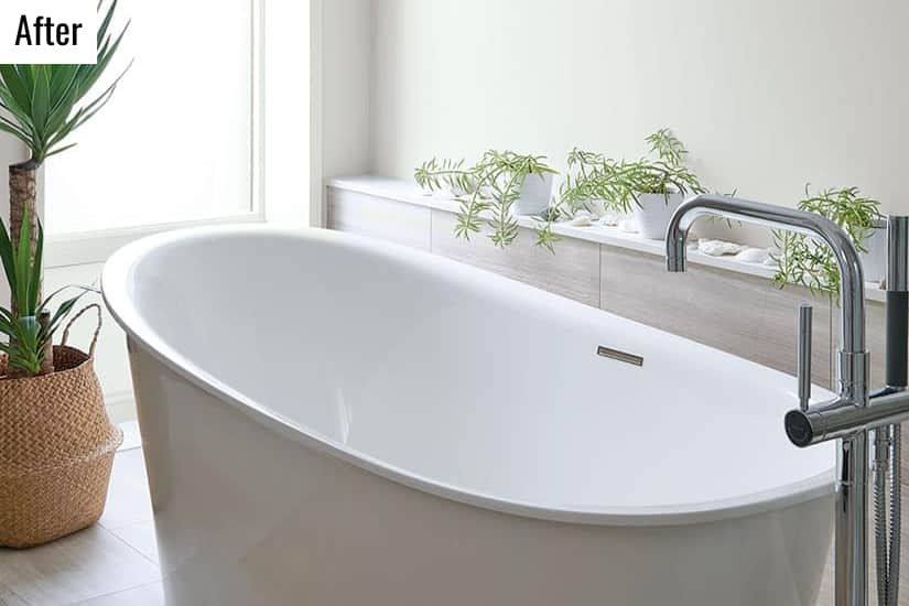
A built-in ledge next to the primary ensuite’s soaker tub is a spot to place anything from toiletries to a glass of wine. Seashells the homeowners have collected are both decorative and sentimental.


Eye-Catching Colour Combinations For Your Home
Comments