
Colour
The hottest colours to paint your home in 2019

Photography: Michael Nangreaves | Producer: Andrea McCrindle | Story: High/low: trendy coral living room
Colour
The hottest colours to paint your home in 2019
We talked to paint experts to learn about the coolest colours to incorporate into your abode in 2019.
1. Blueprint by Behr

Image: Behr
Behr’s Colour of the Year for 2019 is a warm and inviting blue that falls somewhere on the spectrum between denim and navy. "Much like the sketches builders rely on to bring an architectural design to life, Blueprint S470-5 lays a foundation for consumers to make their unique vision a reality," says Erika Woelfel, vice president of colour and creative services at Behr. "This universally appealing hue provides a steady stream of positivity and is poised to be an instant classic for years to come."

Photography: Stephani Buchman | Story: A cozy and modern family home punctuated with earth-tone accents
Easy and accessible, this colour is bound to be seen in homes across the country in 2019. We think it's the perfect colour for a bedroom, as it'll help create a serene atmosphere. Pair with neutrals, some greenery and black accents for a sophisticated look.
2. Metropolis Lilac by Valspar

Image: Valspar
For 2019, Valspar has released a palette of 12 Colors of the Year — one for each month. "The Valspar Colours of the Year are bolder takes on basic colours to provide colour-curious consumers the opportunity to create change within their homes in an easy, fun and attainable way,” says Sue Kim, Valspar Senior Colour Designer at Sherwin-Williams Consumer Brands Group. “We believe changing your outlook can be as easy as changing the paint on your walls.” Metropolis Lilac, one of the richer shades in the palette will bring an unexpected pop of colour and an optimistic feeling to your home.

Photography: Stacey Brandford | Story: Icy blue cabinetry and a marble-look island give this kitchen a retro chic look
Try it in an unexpected way — like on kitchen cupboards — for add a fun, modern spin.
Cavern Clay by Sherwin Williams
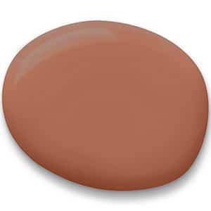
Image: Sherwin Williams
If you’re looking for a neutral with a quick beating pulse, look no further than Sherwin Williams’ 2019 Colour of the Year, Cavern Clay. This warm terracotta is simultaneously earthy and modern and has a lot of soul. "We believe 2019 will be a renaissance of the 1970s—with a twist,” says Sue Wadden, director of color marketing, Sherwin-Williams. “In the coming year, we will embrace our pioneering spirits and artisan ingenuity. Our 2019 Color of the Year, Cavern Clay, embodies renewal, simplicity and free-spirited, bohemian flair."

Photography: Michael Nangreaves | Story: High/low: trendy coral living room
Use this warm hue for a statement wall in a living room. Teamed with artsy extras and plenty of prints, the room will adopt a cool boho feel.
Metropolitan by Benjamin Moore

Image: Benjamin Moore
In keeping with the neutrals that have long dominated the world of interior design, Benjamin Moore has declared Metropolitan, a soft and sophisticated shade of grey, its Colour of the Year for 2019. "Comforting, composed and effortlessly sophisticated, Metropolitan AF-690 exudes beauty and balance," says Ellen O'Neill, Benjamin Moore Director of Strategic Design Intelligence. "It's a colour in the neutral spectrum that references a contemplative state of mind and design. Not arresting nor aggressive, this understated yet glamorous gray creates a soothing, impactful common ground."

Photography: Eric Forsyth | Story: A family home that's equal parts laid-back and sophisticated
Used in the bedroom and teamed with other soft hues — like sky blue — and metallic accents, it'll help create a calm space, perfect for retreating to after a long day.
Night Watch by PPG (Dulux)

Image: PPG(Dulux)
Dark and deeply luxurious, PPG’s Colour of the Year, Night Watch, is a shade that evokes the tranquillity of nature. “Night Watch is about bringing the healing power from the outdoors into your home through colour,” says Dee Schlotter, PPG senior colour marketing manager. “The dark green hue pulls our memories of natural environments to the surface to recreate the calming, invigorating euphoria we feel when in nature.” Pair this shade with gold or brass to really elevate this colour at home.

Image: Michael Nangreaves | Story: High/low: moody, chic dining room
A dining room is given a dapper feel when painted in this rich hue. Paired with rich woods and accented with greens, this enchanting shade will help create a warm winter hideaway in your quarters.
Recommended

Comments