
Living Room & Dining Room
A Hamptons-inspired home boasting hits of saturated hues

Image: Tracey Ayton
Living Room & Dining Room
A Hamptons-inspired home boasting hits of saturated hues
A Vancouver designer dials down the pigment in a family home for a timeless look with a chic Hamptons twist.
Colour. It has the power to totally transform a space – no sledgehammer or crowbar required. And, as these Vancouver homeowners discovered, pigment is as equally powerful when it’s subtracted as when it’s added.
“All the walls were painted either mustard yellow or deep red,” says one homeowner, recalling the original state of the 3,200-square-foot house she and her husband bought for themselves and their two young daughters three years ago. Boasting open-concept Craftsman-style architecture, a classic kitchen and dark hardwood floors, the 2007 build “wasn’t quite us,” she says.
Looking to update the main floor with a fresh Hamptons-esque flair, the couple turned to designer Karla Amadatsu of Kerrisdale Design. Having admired her soothing classic-with-a-touch-of-modern aesthetic for years and bringing little furniture from their significantly smaller former pad, the pair was happy to give the designer carte blanche.
And blanche she did, painting every wall a creamy white. “That alone was a huge transformation!” exclaims Karla. Next, the designer sourced or custom designed the major furniture pieces, opting for mostly traditional styles, including a diamond-tufted roll-arm chair for the living room, a Louis XVI-style settee for the kitchen eating area and William Birch-look sofas for the family room. “Classic furnishings with great lines are solid basics that you’re going to love for a long time,” says Karla, who employed neutral envelopes for the same reason.
To animate the space and subtly introduce the upscale East Coast aesthetic the homeowners sought, she layered in a variety of natural textures – weathered wood, linen, sisal – and accessorized with dreamy blue and purple accents that are easy to switch out in favour of other shades should the homeowners want to change it up.
“We really liked the house before, but it feels so much more open and fresh with the new palette,” says one of the homeowners. “It’s such a soothing, relaxing environment. We love coming home!” They love it so much, in fact, that Karla is currently busy at work updating the second floor.

Though most of the dining room furnishings and accessories – including a glass chandelier and an ornate Venetian mirror – are new, they have a traditional appearance that lends a formal feel. Meanwhile, violet accents energize the space, and a velvet slip-cover on the table’s head chair and a patterned sisal rug wink at coastal living.

Leaning in a slightly more modern direction than the rest of the main level, the living room features an eclectic mix, including a funky oval shell-veneered coffee table, boho toss cushions and nature-inspired artwork. But tradition is very much evident here, too: “The tuxedo sofa was the client’s mom’s,” says designer Karla Amadatsu, noting that it has been reupholstered several times. “It’s really neat to incorporate a classic piece the homeowner grew up with.”

By far the most colourful space in the home, the living room plays host to a boho combination of indigo, violet and fuchsia elements like the block-printed ikat toss cushion and over-dyed rug. They’re pretty counterpoints to the neutral, natural and traditional touches, which connect the space to the rest of the main floor.

Boasting traditional silhouettes, the eat-in area’s furnishings appear precious, but are actually far from thanks to the leather-look vinyl fabric used on the seating and the dining table’s distressed oak. “All the textiles have stood up to our daughters,” says one of the homeowners, “and the worn wood pieces don’t show scratches.”

“With a neutral palette, texture is so important,” says Karla, who introduced a variety of subtle surfaces to ensure her design didn’t fall flat. In the family room, for instance, the wool rug has a fine diamond pattern, while the wooden coffee table boasts an engaging grain. “You don’t pick up on these things right away, but all those layers add up to a dynamic effect,” she says.
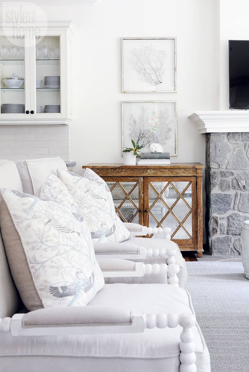
Much like the way she approaches colour, Karla prefers to tread lightly when working with themes. the homeowners are drawn to a Hamptons vibe, so she peppered in a handful of beachy elements, such as coral artwork and large seashells. “Nothing overt – just organic touches and bits of nature,” says the designer.
Comments