
Colour
Designers Share Their Go-To Colour Palette For Timeless Design

Photo courtesy Provoke Studios | Design by Lori Steeves/Simply Home Decorating
Colour
Designers Share Their Go-To Colour Palette For Timeless Design
Eager to create a timeless design? Here's where to start.

- Ashley de Boer, founder and principal designer with Ashley de Boer Interiors in Vancouver
- Lori Steeves, founder and creative director with Simply Home Decorating in Vancouver
- Nadine Sakr, interior designer and decorator with Nadine Interiors in Oakville, Ont.

The word “timeless” is tossed around a lot in the design world. From furnishings to paint colours to layouts, we all want our beloved investments (AKA our homes) to stand the test of time. But in practice, how do we achieve this? What makes for timeless design?
In the first edition of our exploration into designing a timeless space, we’re digging into one of the most important pieces of the puzzle: colour.
“A colour becomes timeless when it works in many environments and continues to feel relevant even when trends shift,” says Ashley de Boer, an interior designer in Vancouver.
We sat down with de Boer—as well as two other Canadian designers known for their classic styles—to get the lowdown on developing the best ageless palette.
What colours are considered timeless?
Colour trends come and go, but the shades that designers return to again and again are all rooted in nature.
“These hues are inherently calming and versatile, creating a backdrop that feels grounded and enduring rather than driven by trend,” says Vancouver-based designer Lori Steeves.
Warm neutrals are at the heart of timeless design, incorporating soft taupes, clay tones, earthy browns, and classic whites. As another nod to the outdoors, muted blues and greens—particularly olives and mossy shades—stand the test of time.
These colours age well because they don’t feel artificial, adds de Boer.
Have timeless shades evolved over the years?
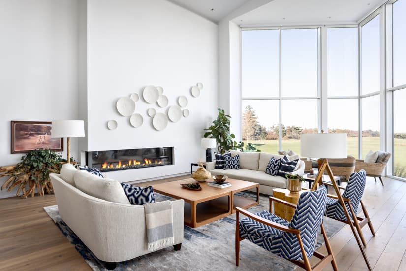
Photo courtesy Provoke Studios | Design by Lori Steeves/Simply Home Decorating
Though it may sound counterintuitive, the short answer is yes.
“While the essence of timelessness remains the same, our interpretation of those shades does evolve,” says Steeves.
Think of the cool grey tones that permeated the 2010s. At the time, they were considered to be classics. “Today, we associate them with a specific era of design and they now feel dated in many spaces,” explains de Boer.
What’s different about natural tones is how versatile they are. Soft shades are not only beautiful on their own, they act as a backdrop to other changing trends.
“These biophilic tones resonate with us on a deep level,” says Nadine Sakr, an interior designer and decorator in Oakville, Ont.
How do you develop a timeless colour palette that still ties in contemporary or on-trend elements?
“A timeless palette provides a solid, neutral foundation, but it’s how you layer in style references that keeps it feeling fresh,” says Sakr.
Build your base with neutral hues, then welcome in pops of trend, whether that’s in the form of colour or furnishings. A timeless anchor palette gives you the opportunity to play around with fixtures, incorporating old and new pieces and swapping out decor with the seasons.
“Colours will come in and out of fashion, but if an interior is really well put together and doesn’t lean too heavily into what’s trendy, it will always stand the test of time,” says Steeves.

Recommended

Toronto House Tour
Comments