
Design Lesson
This 1990s Interior Design Trends Is Back: How To Decorate With Nostalgic Colours

Photography by Stacey Brandford
Design Lesson
This 1990s Interior Design Trends Is Back: How To Decorate With Nostalgic Colours
Saturated ’90s shades have returned. Samantha Pynn shares how to bring balance to bold colour palettes.
From rich forest greens to sunbaked terracotta to deep reds, 1990s colours are making a bold comeback. Whether you’re ready to drench your walls or simply add a splash of colour through art or textiles, follow along to learn how to embrace these nostalgic palettes.
How to Use the Colour Wheel With Bold 90s Colours

Everywhere you look, our walls, cabinets and furnishings are getting drenched in full-bodied reds, earthy browns and all shades of green, and our upholstered furniture is following suit. If you’re considering going bold with colour, my advice is to use the colour wheel, a decorating tool that was big in the ’90s. Learning how to balance these saturated shades is key. Choosing analogous colours (those that are side by side on the colour wheel) will make a space feel harmonious, while choosing complementary colours (those opposite on the colour wheel) will give your home an energetic vibe.
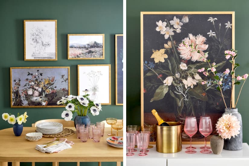
To create an enveloping feeling in this dining room, I painted the walls, baseboard and doors in Muse, a nostalgic forest green and BeautiTone’s 2026 Colour of the Year. Then, to keep the space from feeling heavy, I lightened up the look with a pale oak table and dining chairs upholstered in soft terracotta (a colour that’s analogous to the moody green).
90s Decorating Rules: Matching Colours Room by Room
With the return of nostalgic colour, it’s not surprising that we’re turning to old-school decorating rules and tips. In the dining room, your china pattern would have provided a jumping-off point for your colour palette in the 1990s; similarly, the floral dishes in this dining room echo the style of the artwork and rug.
In the bedroom, consider matching your paint, drapery or upholstery to a secondary or tertiary colour from a patterned duvet or sheet set. In the living room, upholstered furniture in a monochromatic scheme will create a calm and soothing space. If a colourful sofa is too much of a commitment, consider a bold-coloured side chair or ottoman.
Of course, if colour makes you nervous, keep your upholstered furniture in a neutral linen or sand tone, then repeat your wall colour in tonal pillows, throws and accessories.
Choosing Art for Rooms With Deep, Bold Colours
Photography by Stacey Brandford
When it comes to deep colour, art can be tricky. Landscapes, botanicals and sketches will create a soothing, sanctuary-like space. Plus, nature-inspired art doesn’t feel jarring against rich hues.
If you don't have a huge art collection but love original art, you can mix a single small piece with secondhand finds, kids’ art or your own framed photography. And there are so many websites, like Juniper Print Shop and Allbright House, where you can buy art that can be downloaded and printed. Here, for a luxe look, I had Posterjack print vintage artworks on fine art paper and then frame them with gold frames to unify the different artworks and add glimmer to the moody green. Whether you opt for a floor-to-ceiling painting, a poster-size print or a gallery of small pieces, use art to soften dark colour.
Recommended


Eye-Catching Colour Combinations For Your Home
Comments